background-logo-Image

The best
tactical shoes

Online store of tactical shoes

Online store of tactical shoes «Kharkiv Master»

#website development

#corporate website

client
client
customercustomercustomer
client

About customer 

"Kharkiv Master" is a manufacturer of tactical footwear for the army, law enforcement and security structures, as well as footwear for active recreation.

The company is the same age as the author of this text. For 26 years, military personnel and representatives of law enforcement agencies have been treading on the soles of the company's products all over the world.

We have come to the conclusion that the nuclear war will survive: cockroaches, scorpions, Drosophila, braconids, and "Kharkiv Master" bers.

Objective
Features
Technical side

Task 

Task

The client wanted to get rid of the old devilish website that did everything to prevent the visitor from buying anything. The company wanted to build a lightweight website on Wordpress. The experience with the previous site formed a laconic demand from the customer: "Do everything to make the product easy to purchase.".

Features

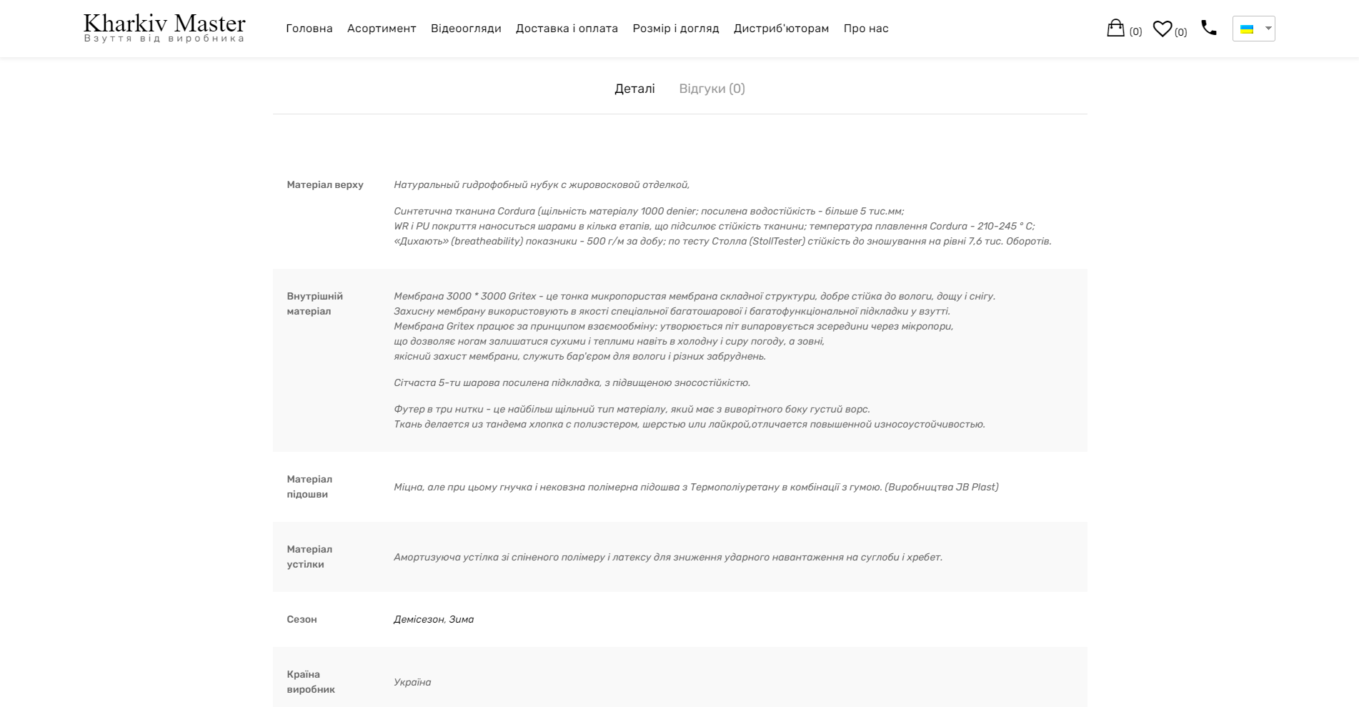
The company's products have long proven themselves on the market. There is a constant steady demand for the products, so the main task was to create a convenient interface for choosing the appropriate model. The manufacturer sews the widest range of models. The visitor should easily choose the right one for himself.

Technical side

Wordpress was chosen as an understandable and familiar CMS for the customer's managers. A mandatory condition was the unloading and transfer of goods from the old site to .NET. with all attributes preserved. The customer's company entrusted us with packaging, architecture construction, design and copywriting.

background-text
background-text
background-text
background-text
background-text
background-text
background-text
background-text
background-text
background-text
background-text
background-text
background-text
background-text
background-text
background-text
background-text
background-text
background-text
background-text
background-text
background-text
background-text
background-text
background-text
background-text
background-text
background-text
background-text
background-text
background-text
background-text
background-text
background-text
background

Analysis and preparation

The portraits of the target audience worked hard. The behavioral characteristics of TA were determined. An analysis of competitors was made. Formed behavioral hooks based on them and designed the site:

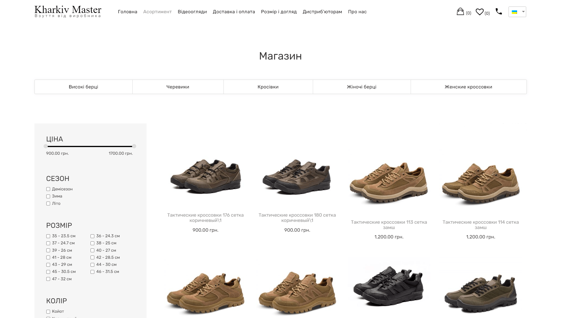
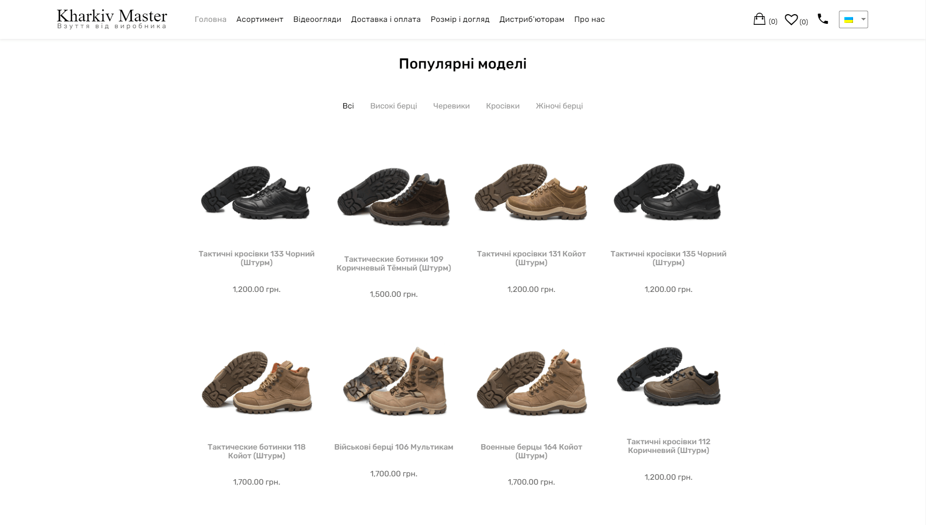
  • For a hot target audience already familiar with the product – convenient categorization, concise visuals, clear and informative product card, simple ordering.
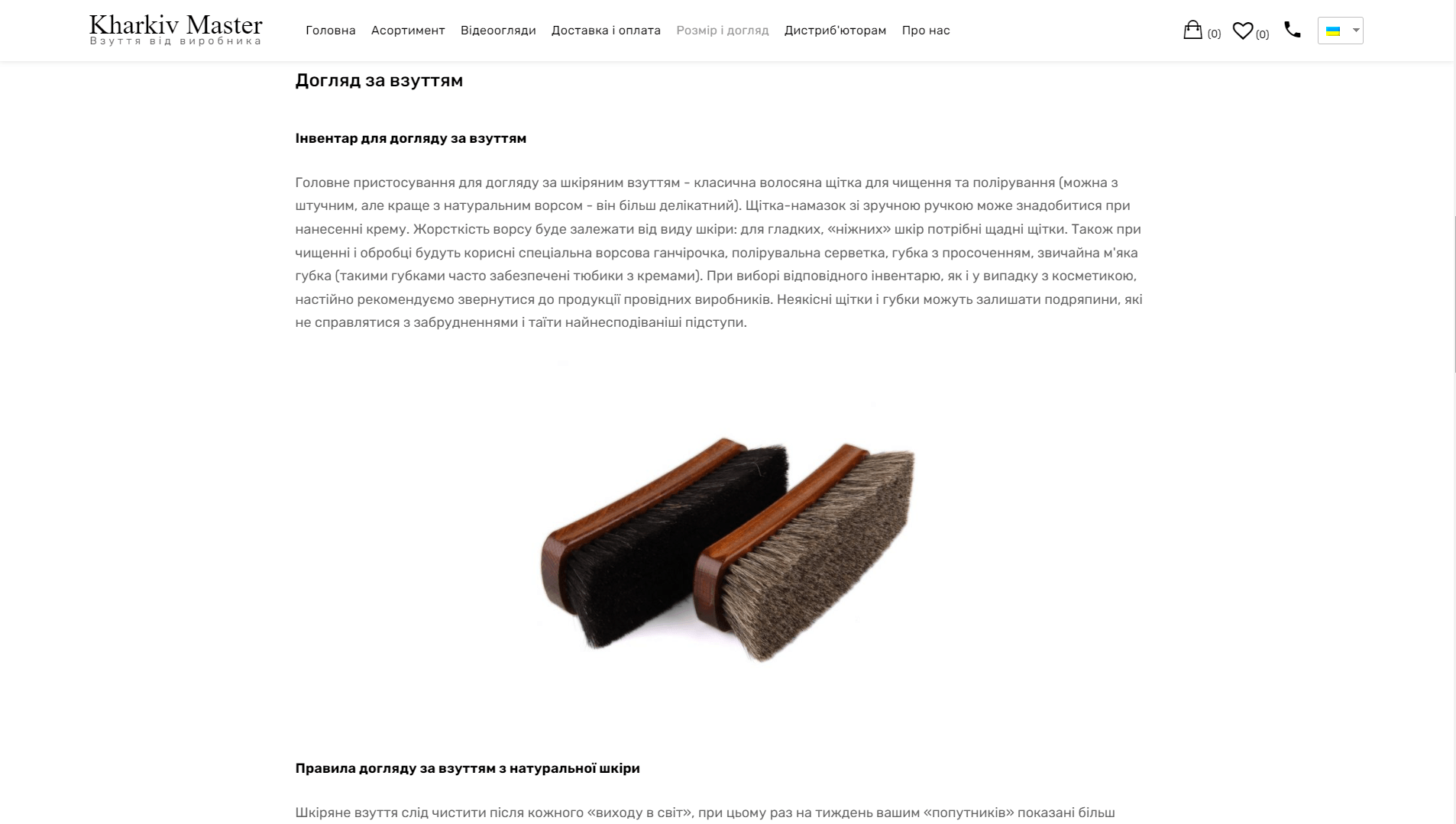
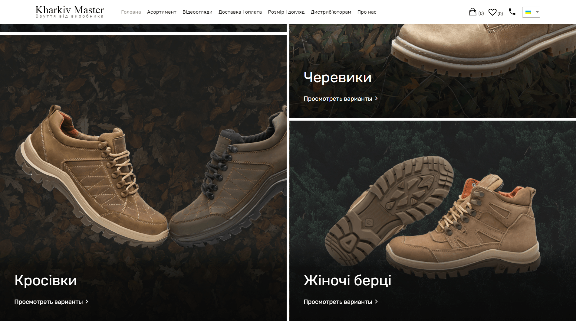
  • For newcomers, the product has been tastefully "packaged", an informative description of the product and full-size studio photos of shoe models have been added.

AND THIS IS WHAT WE DECIDED TO DO 

01
01

Зустрілися, посиділи та поговорили. Нам розповіли про виробництво та продукт, описали цільову аудиторію та модель її поведінки. Замовник надав ТЗ, ми ознайомилися та відповіли відредагованою версією.

background
02
02

Попрацювали з фокус-групою, визначили реальні потреби холодної та гарячої аудиторії. Потім глянули на конкурентів, поплакали та почали прототипування.

background
03
03

Визначили структуру сайту, потім накидали чорновий варіант прототипів: Головна, картка товару, розділ із категоріями та інші сторінки. Звірилися із ТЗ. Сподобалося настільки, що вирішили відразу приступати до роботи.

background
04
04

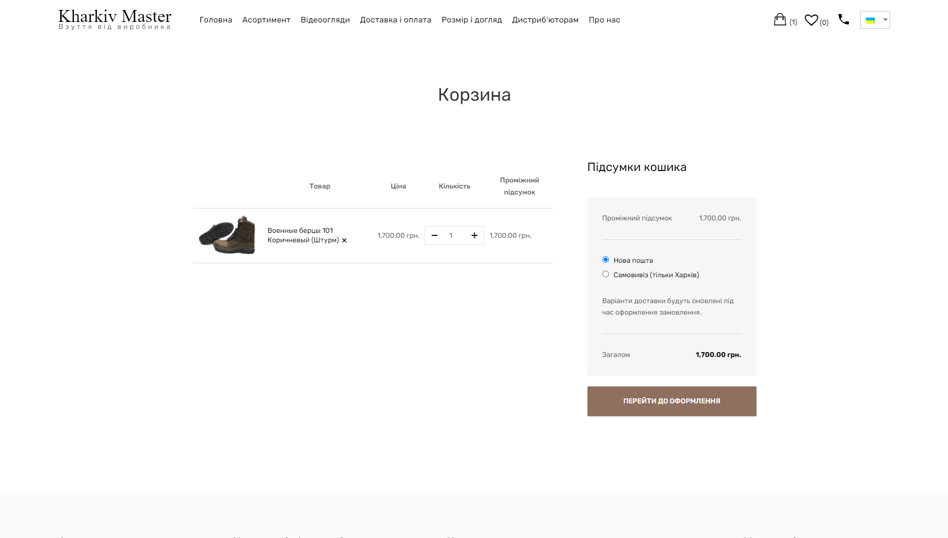
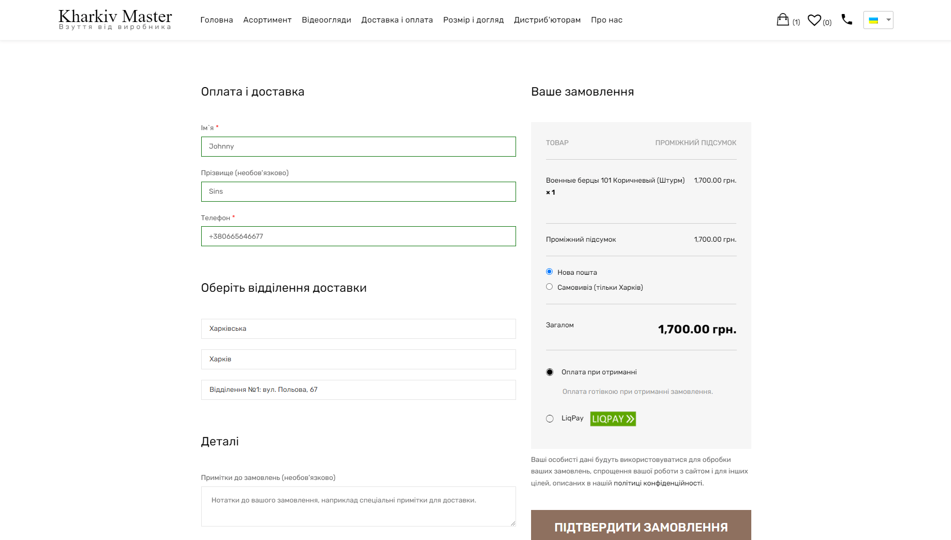
They were guided by three rules: visibility, simplicity and simplicity. Colorful detailed photos, simple filters and categories. Purchase is also a few clicks away. The grandmother of the programmer was asked to make an order, and she easily coped. This is success.

background
05
05

The project was deployed on Wordpress. We don't really like it, but it was a mandatory condition of the customer. The template has been significantly redesigned, especially its mobile component. We imported the product range from the old site. Errors were removed, supplemented with high-quality photos and uploaded to the site. We have created a simple categorization and filter system. The card displays all the necessary characteristics. The design is very light, nothing superfluous.

background
06
06

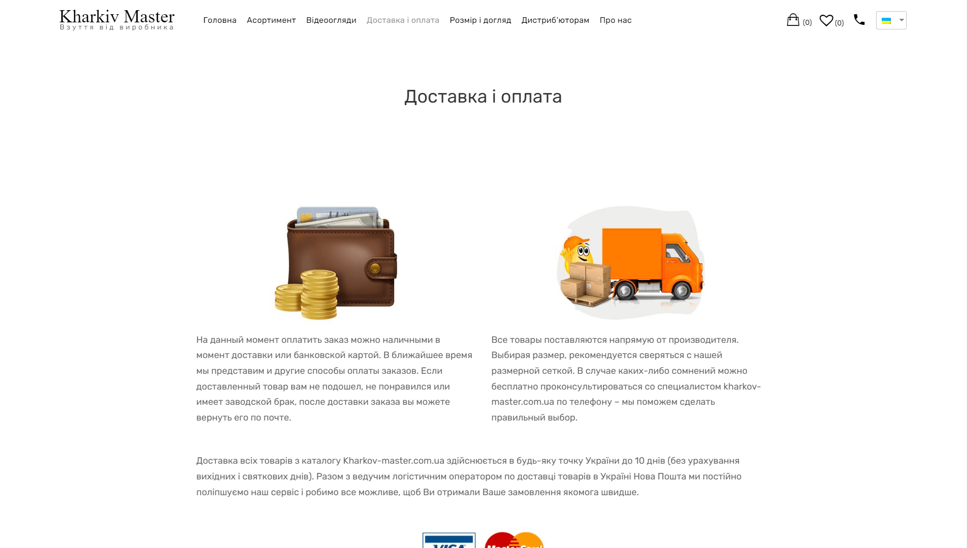
Installed Liqpay online payment option and online consultant - rules of good tone today. It was proposed to add a category of cosmetics for shoes, a section for product care instructions and a section for video reviews of popular models were created.

background
07
07

Primary optimization was done: setting up robots.txt, setting up the main mirror, compiling an XML sitemap, optimizing content and scripts, optimizing semantics

background
background-image

Design – result

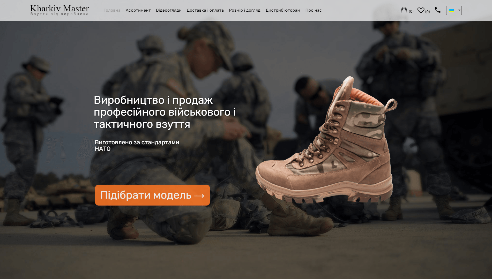
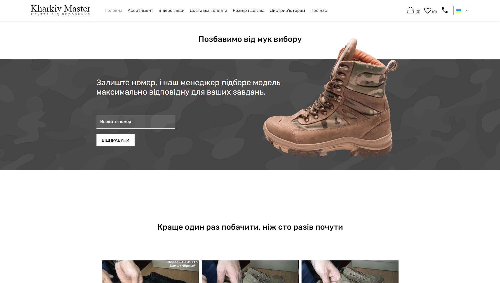
    "Berts and nothing extra" - this is how the design motto of the project was defined. We focused the attention of users on the selection of goods and the visual and textual description of the items. At the same time, it was possible to get a unique style of the site, which clearly separates "Kharkiv-master" from its competitors.

If you want the same or even better – click here

background-img
background-img
unobvious details

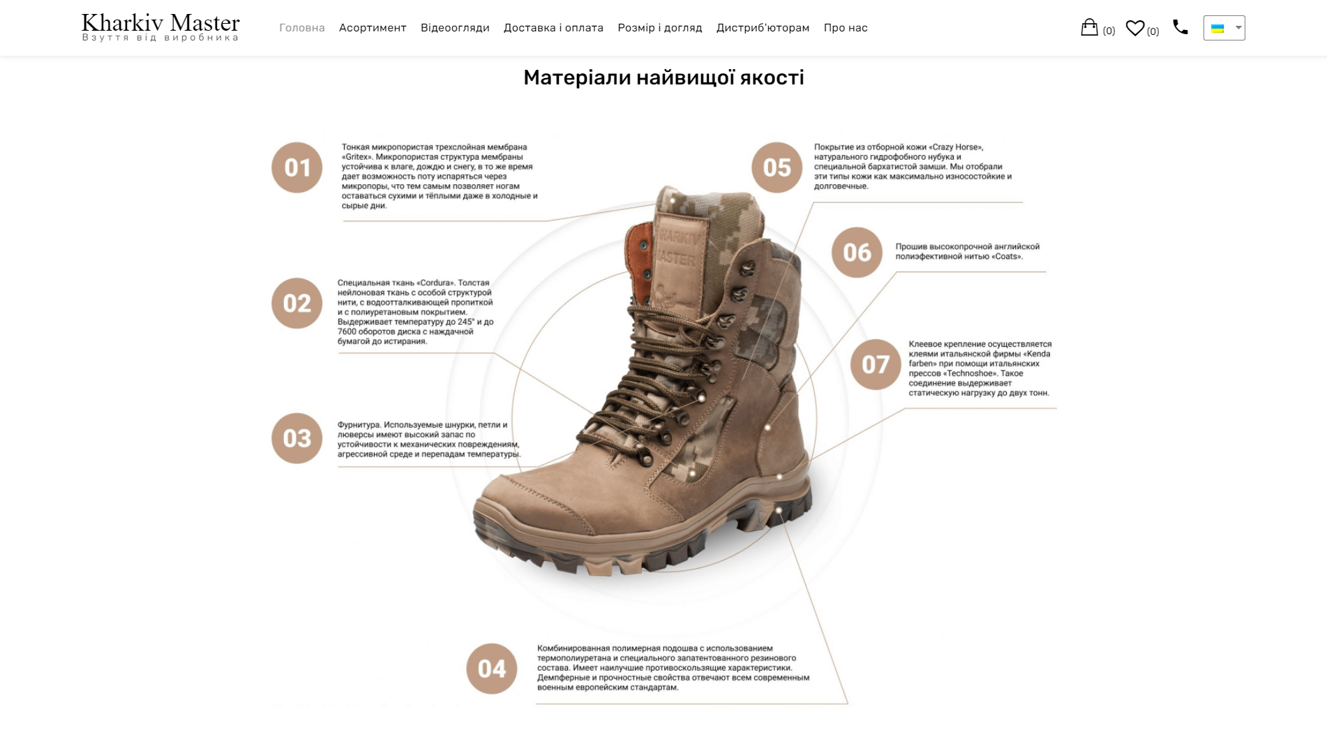
The online store does not allow you to try on shoes. But we tried to do everything to make the visitor fall in love with the product with his eyes.

ZGRZ
background-img
background-img
accentsaccentsaccents

"Kharkiv-master" products are Tesla in the field of tactical footwear. The guys are so obsessed with technology that their berets are listed in the NATO military. All this was packaged for a "cold" audience.

Result 

The online store "Kharkiv-master" is a find for its target audience. Funnels of "cold" and "warm" audiences work perfectly and generate the required volume of orders every day. Production is developing and successfully implementing a retail plan.

background-image

ZGRZ